
B2C
UI
Mobile first


YEAR
2023
SCOPE
Delivery
TOOLS
Figma, Notion
🔎 About Spotify
Launched in 2008 in Sweden, Spotify is now one of the most popular music streaming services in the world; providing access to a vast online library of music and podcasts. I had the opportunity to work on this project during my Product Design bootcamp with The Design Crew.
✓
+ 500 millions
monthly active users
✓
210 millions
paying subscribers
👩🏻💻 About my role
I was involved in every step of the design process, with a particular focus on UI Design. I found it particularly interesting to find ways to implement this new feature in various entry points, within Spotify's existing ecosystem.

ROADMAP
For this project, we focused only on delivery, as the problem had been defined beforehand: there is a clear business opportunity for Spotify to start selling concerts tickets.

THE PROBLEM
How can we implement a ticket selling service on Spotify's app ?
OBJECTIVES
💶
Financial
Increase revenue for Spotify, artists, concert halls & festivals
⭐️
Promotion
Promote rising artists' concerts, based on likes & localisation
🎯
Position
Position Spotify as a key local player within music communities
IDEATION
Generating as many ideas as possible thanks to tools and workshops
Using ideation tools such as mindmapping, crazy eights and storyboards, we generated many possible ideas to answer Spotify's challenge. We decided to prototype and test the ones that fitted best with the timeline, the scope and the KPIs of the project.
After that phase, we decided to pick the ideas that would have the most impact and added value on our project.
🙌 Ideas we kept
Concert filter on the homepage
Booking & payment funnel
Event page
Easy access to purchased tickets
🗑 Ideas we dropped
Social feature
Push notifications
BENCHMARK
Dice
—> Intuitive and modern booking and payment experience, enabling the user to book a ticket easily and quickly.
Shotgun
—> Clear presentation of the event page, containing all the useful informations
Fever
—> The app gives an easy access to the tickets bought, using a clear icon and a visible entry point in the menu
PROTOTYPING

PROTOTYPE V1
Based on our ideation workshop, we selected 3 main ideas to prototype on Figma and test. Our major UI challenge was to keep a consistency with the existing design system of Spotify.
Explore upcoming concerts
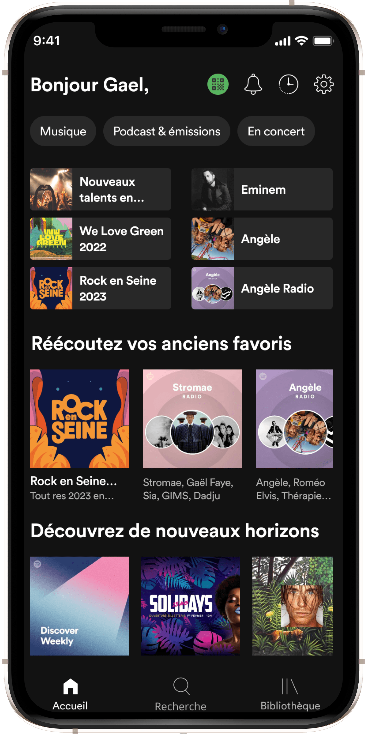
We worked on various entry points in the app to give access to the concerts : Homepage, Search tab, Artist page, etc.
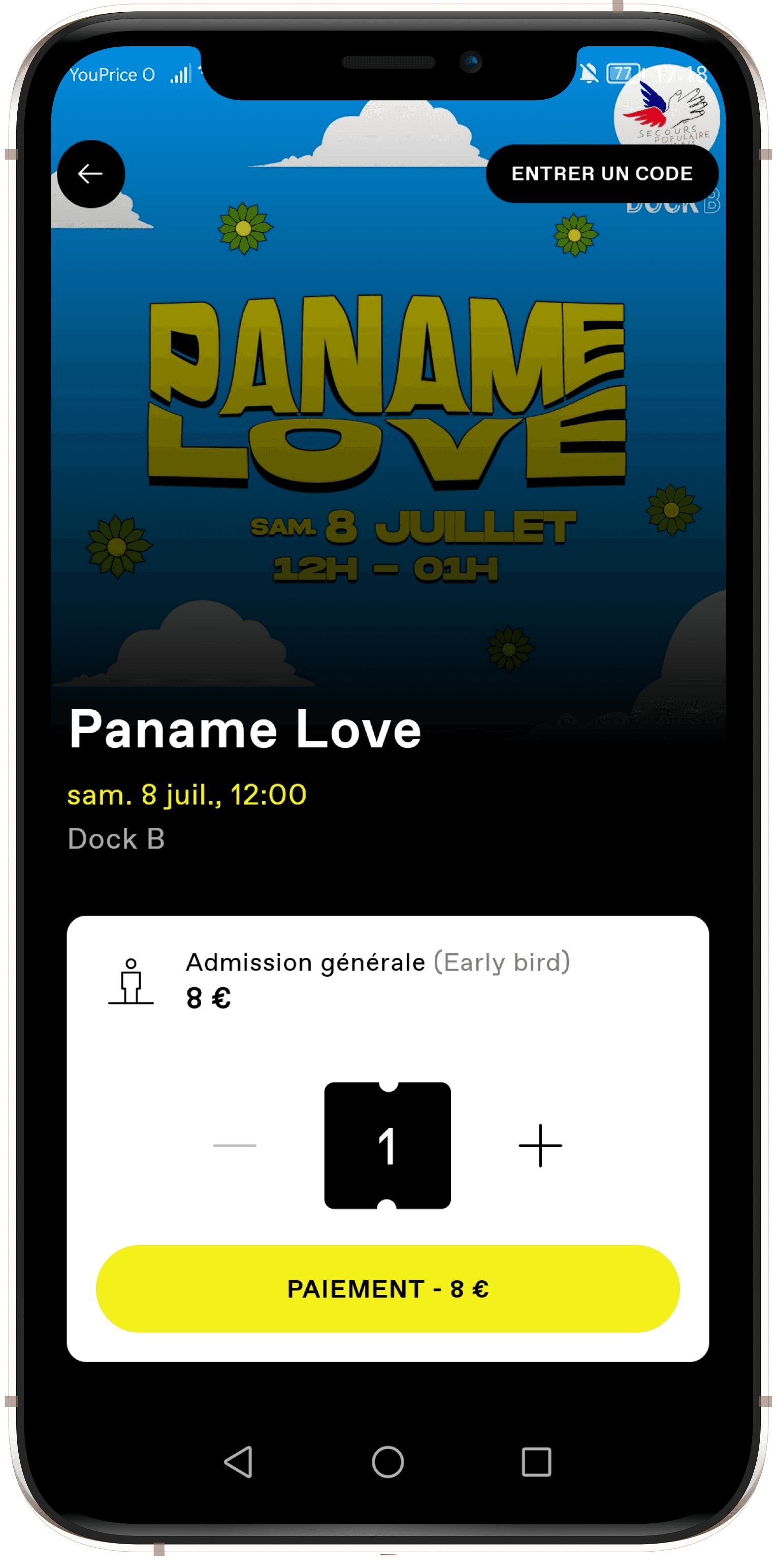
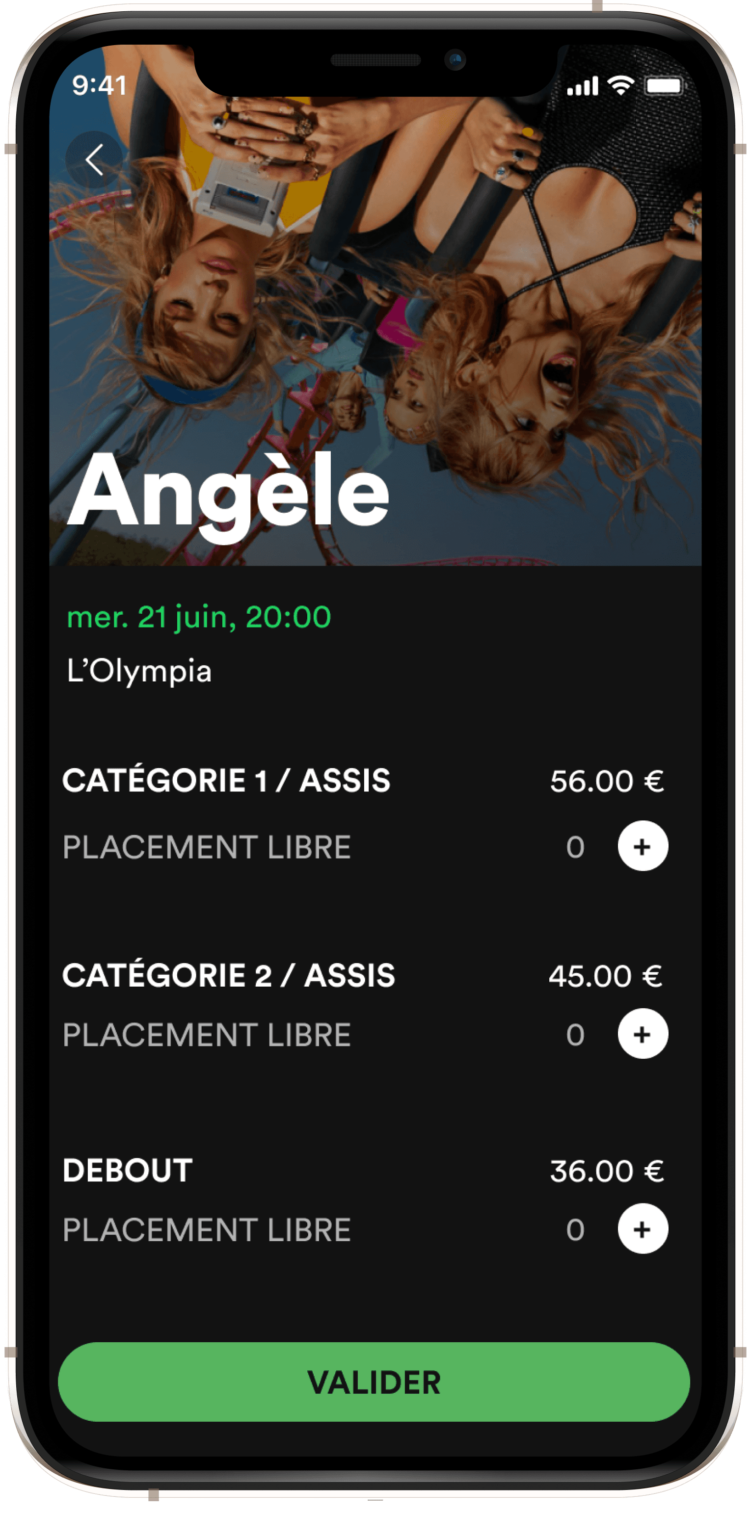
A simple booking funnel
Inspired by our benchmark and by the minimalism of Spotify's app, we prototyped an intuitive booking and payment funnel
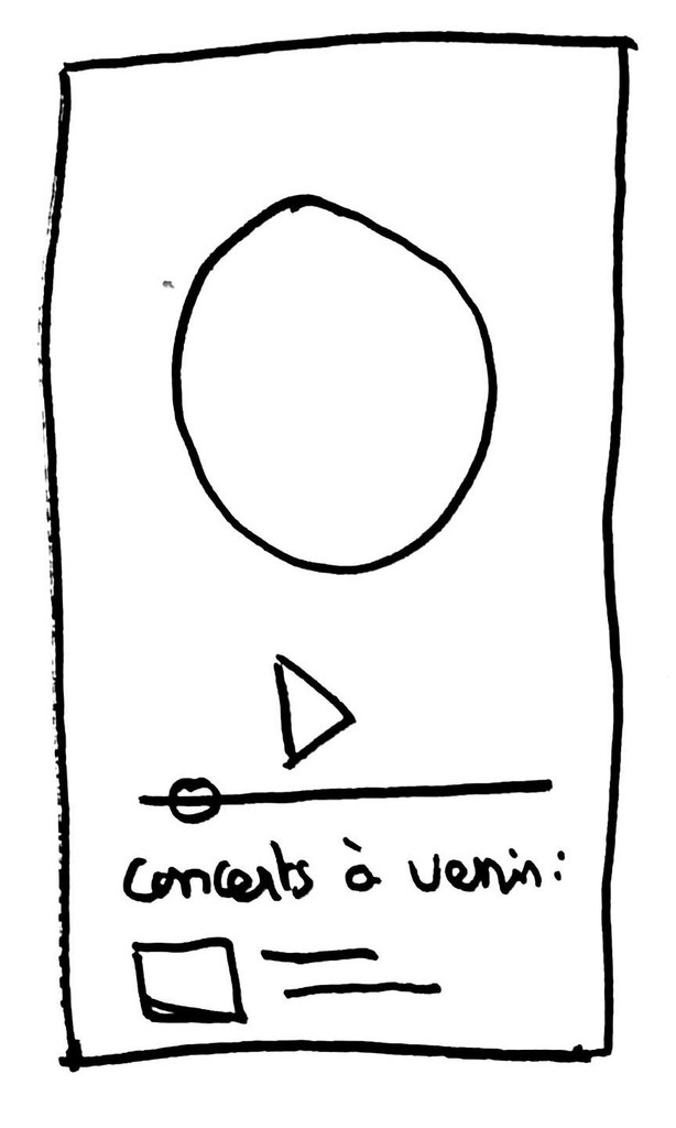
An easy access to tickets
After purchasing their concert tickets, users should easily be able to find their tickets in the app
USER TESTS
🗓 Methodology
To test our new features and collect feedback, we conducted user tests. We interviewed 5 people, users and non users of Spotify.
Semi-directed tests
5 testers
30 minutes
via Google Meet
👤 Profiles


✅ What worked
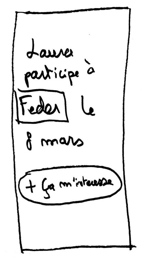
5/5 found the booking and payment funnel very simple and intuitive
We designed a minimalistic booking and payment funnel, in a few simple steps, inspired by our benchmark. All of our users found it easy and efficient to book concerts tickets.
- Audrey


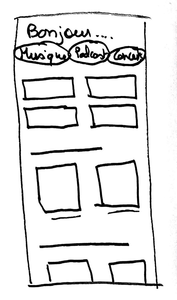
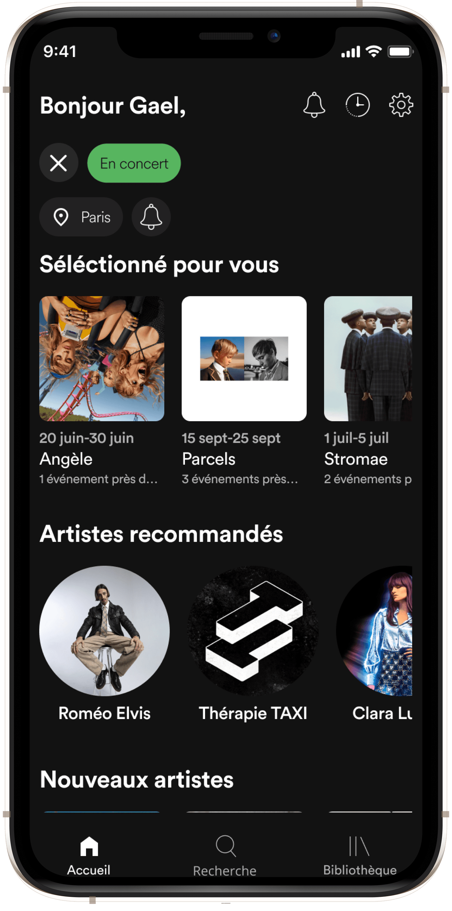
4/5 spontaneously looked for concerts from the new filter on the homepage
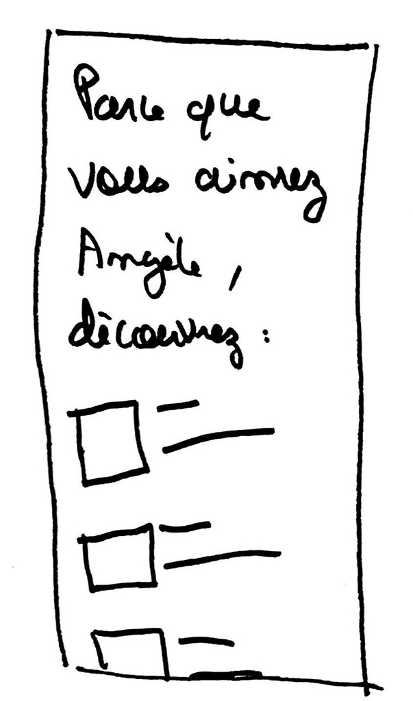
We added on the homepage a filter "En concert" next to "Musique" and "Podcast & émission" to enable users to find recommended concerts easily.
- Elisabeth

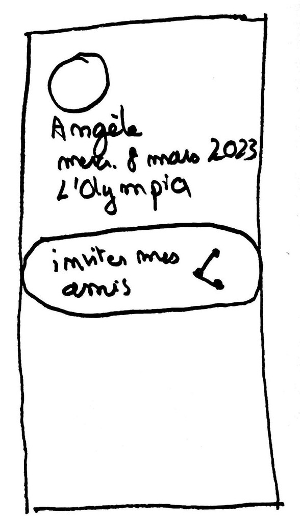
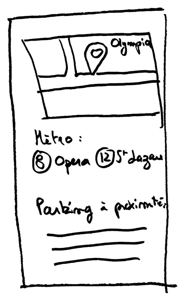
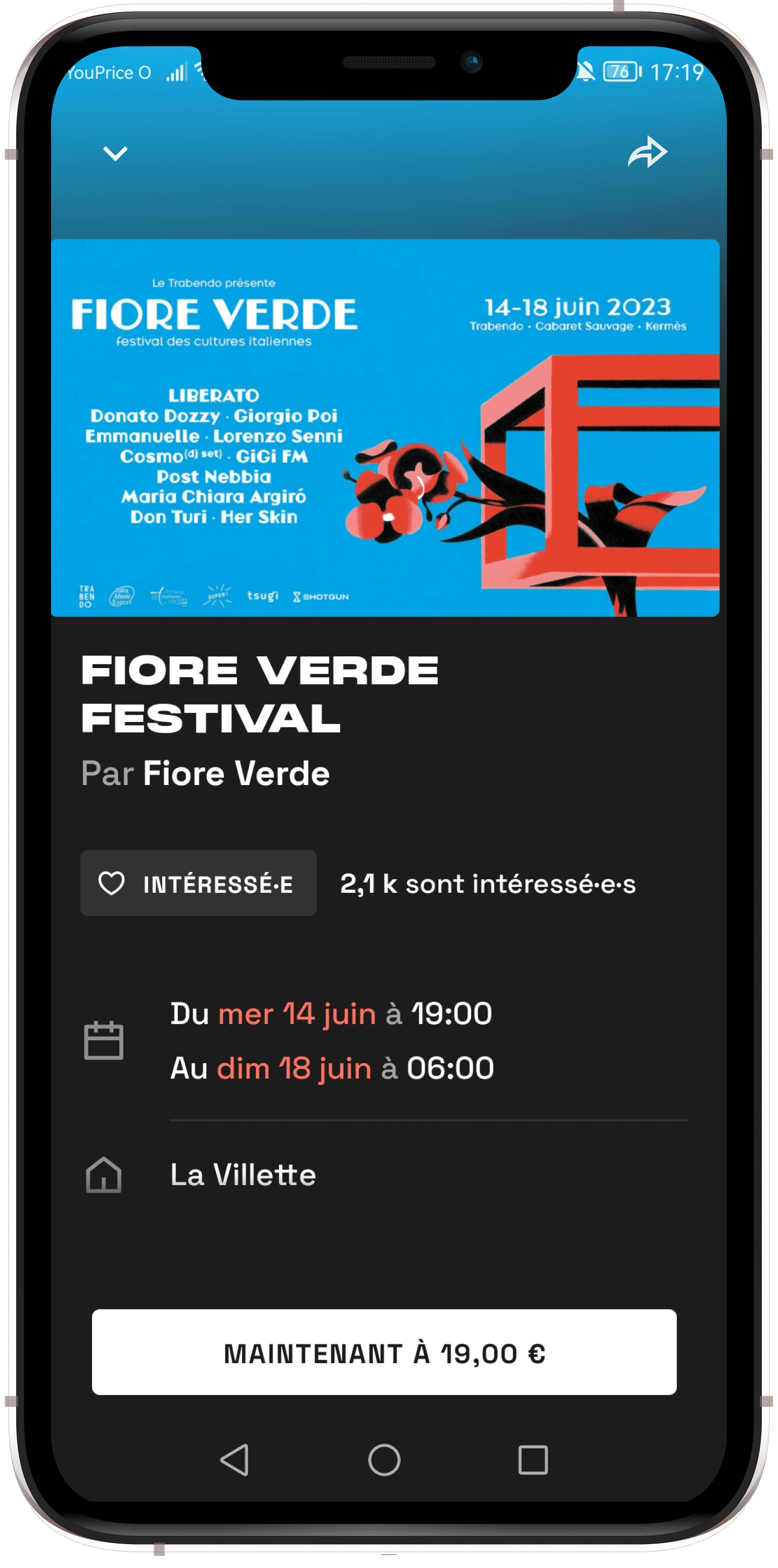
5/5 found the new Event page very clear and useful
We designed an Event Page containing the key information of a concert : artist's information, concert hall's address and access, date, hour, and a sharing feature to send the event page to a friend.
- Elisa


🛠 What we reworked
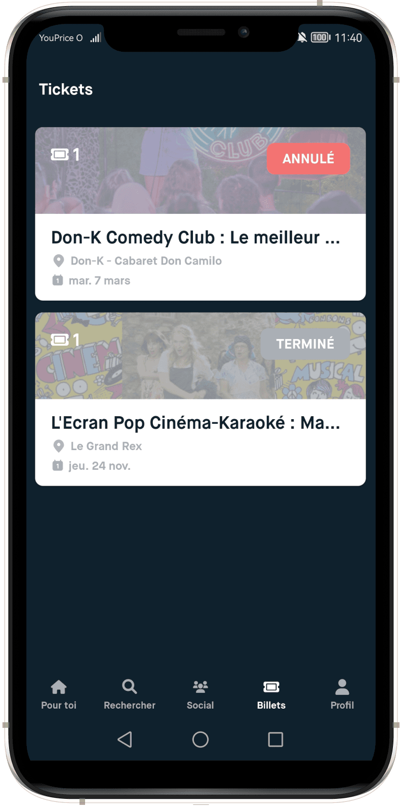
1/5 found easily their purchased tickets
The user tests revealed that the icon we used (a QR code) wasn't clear to our users. Also, they didn't all spontaneously look for their tickets in the homepage : most searched in the Library tab.
- Clémence
—> What we changed : we changed the QR Code icon to put a clearer ticket icon instead. This ticket icon is displayed on the homepage and goes green, once a ticket is purchased and is awaiting use. We also added an entry point in the Library.
Prototype V2 :


Prototype V2 :


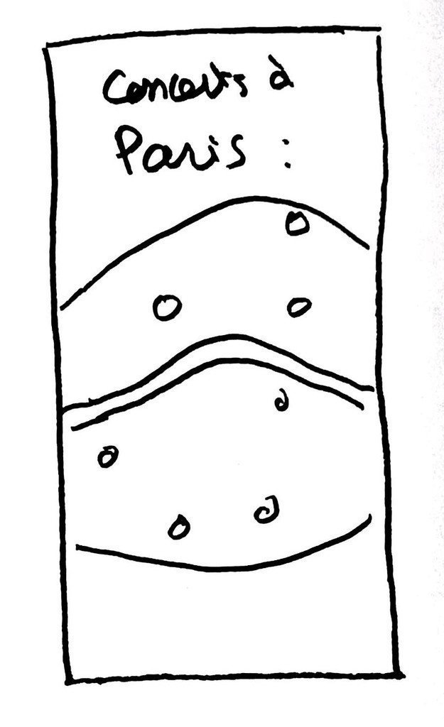
3/5 intuitively went in the Search Tab to look for a specific concert
In our first prototype, we decided to test the entry point through the homepage only, to see if it was intuitive to look for recommended concerts there. However, users also looked in the Search Tab to do a specific research.
- Elodie
—> What we changed : we designed an access to look for concerts in the Search Tab: through the categories, and through a specific search.
FINAL PROTOTYPE
FIGMA FILE
It's important to work in an organized Figma space in order to make the team work as easy as possible. It also facilitates greatly the process of iteration. Here is an extract of our Figma file :

NEXT STEPS
Here are a few ideas of how we could push this project further :
🧪
Tests
Conducting more tests on our prototype could enable us to improve it even more.
🧑💻
Development
Working with a developer team to implement our solution in the app.
📤
Handoff
CONTACT